

March 25, 2012
At Golden Dawn
March 24, 2012
Blå bilder


After months of dulling grey Malmö skies, which seem to have seeped into my head and clouded my memories of my trip to Auckland like a heavy fog, things are looking up. The Spring equinox has come and gone, officially opening the season, and with daylight savings beginning tomorrow evening and positively balmy temperatures of 14 degrees, blue skies and long light evenings loom ahead of me. And finally, showing some photos of my 6 weeks in New Zealand doesn't feel like looking at Oz from the greyscale of Malmö's Kansas.
Though the actual weather in Auckland left much to be desired (daily surprise rainfall, blustery gales,constant cloud cover) I cannot help but associate the holiday with the colour blue, spending days clambering over rocks of Rangitoto, having 2 hour swims in the sea two times a day, fishing around the rocks at Matakatia and failing to catch anything, following the bays around Tamaki Drive, kayaking on the sailfish built by my uncle and grandfather, or rowing in the dory before it mysteriously vanished from the beach one morning never to be heard of again. Fate to this day, is unknown.
I could never live anywhere that wasn't near the sea. Swimming in the rain is one of the best feelings, and so is swimming in the early morning.
Looking at these is making my feet itch, wanting to take my new Marni for H&M swimsuit down to the beach for a dip. I now have three pairs of togs, and all of them are blue. Must be something subconscious about wanting to blend into my surrounds.
March 11, 2012
Attention to detail


Daan van Golden
His relatively small but diverse body of work is characterized by an acute attention to detail. References to important works from art history, as well as to less exalted images from commerce, pop-music and daily life are important components of his work. Van Golden has never been too concerned about prevailing artistic trends and has always carved a path of his own. His art does not consist of large brushstrokes, but of a much more modest gesture: his paintings are the result of a labour-intensive process, whereby a visual motive is explored in a very careful and precise manner.
Martin Creed at sketch:
Work No. 1347 consists of 96 different types of marble, in a formation of zigzagging lines across the floor, while Work No. 1343 is a new work specially made for the restaurant in which every single piece of cutlery, glassware, lamp, chair and table is different.
Attention to detail is an important thing. Something I seriously consider and take pride in with my work. While I appreciate the grand gesture, the found object, and the impersonal minimalism, there is something about labour intensive finely detailed craft which resonates with me. Details are what give things credibility and authenticity apparently - at least this is what people praise and/or complain of in any televised period drama. The measure of something.
I like to think of details slowly building themselves up, accumulating numbers until their presence is inescapable. I strive to create a sort of push/pull effect - where the audience must step back from the work to take in the full picture, but afterwards are pulled close to see how the image is made.
It is in the details that one finds the clues in a murder mystery ("The Murder Mystery" could pretty much be a concept by which I question the meaning of life through my art practice). Red herrings too. It could just be the way a person phrases a sentence that gives the game away. I like to try and watch out for it, pick up the clues en route, and form an educated guess as to whom the perpetrator could be. It rarely, if ever happens like that however.
At this point it feels apt to admit that every single school report card given to me used the word 'diligent' in some capacity. It is a word that follows me around, and during my final year of art school, finally infiltrated my studio.
Before I used to sit on an idea, shape it like a bit of clay in my head, bolstering it with various concepts, cultural references and the like. My idea process changed while my work changed, and it took on a more insular, patient, labour-orientated facet, and all this time spent working, was also spent thinking, and both started to influence and build upon each other, and also from the music playing while this working and thinking process is going on. Hmm, sounds pretty wishy-washy. Bit new-age, 'organic'.
I guess what I am trying to with my writing these days is a similar method to working and thinking simultaneously. Trying to reach some level of clarity just by typing sentences around some of the thoughts in my head. Different ways of saying the same thing. These days I just start writing things down/typing things out, seeing where they will lead me and how often I repeat myself.
And by-the-by, I am convinced that Van Golden's work of the young girl cartwheeling is out of sequence. Surely the 3rd and the 4th images should be switched around to give a complete cartwheel? But maybe, that is the whole point of it - that the details don't add up.
March 10, 2012
Sad songs
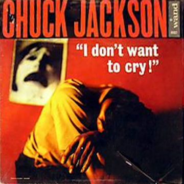

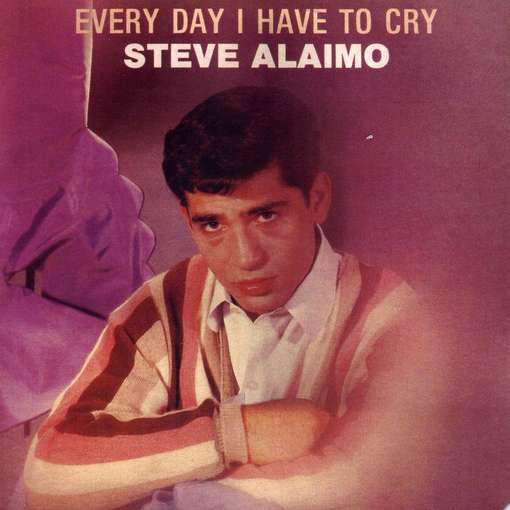
Chuck Jackson's debut 1962 album was 'I don't want to cry!'. Along with Lesley Gore's debut 'I'll cry if I want to' and Steve Alaimo's 'Every day I have to cry' both released in 1963, the album featured tracks solely devoted to the subject of crying.
Not only amazing collections of misery-laden songs, the covers for these three records have to be some of the best I have seen, the expressions of sorrow on the face's of Gore and Alaimo especially perfect, while the dark Lynchian anguish on Jackson's debut seems ahead of it's time.
These three portraits would make an excellent triptych, and the track listings read like a emo's teenage poetry.
I don't want to cry! (Chuck Jackson)
I Don't Want to Cry
Tears on My Pillow
My Willow Tree
In Between Tears
Tear of the Year
I Cried for You
Lonely Teardrops
Don't Let the Sun Catch You Crying
Salty Tears
I Wake Up Crying
A Tear
A Man Ain't Supposed to Cry
I'll cry if I want to (Lesley Gore)
It's My Party
Cry Me A River
Cry
Just Let Me Cry
Cry And You Cry Alone
No More Tears (Left to Cry)
Judy's Turn to Cry
I Understand
I Would
Misty
What Kind of Fool Am I?
The Party's Over
Every day I have to cry (Steve Alaimo)
Every Day I Have to Cry
I Don't Want to Cry
My Heart Cries for You
I Cried All the Way Home
Cry Me a River
I Wake Up Crying
Side 2
Cry
She Cried
Don't Cry
Cry of the Wild Goose
Cry Myself to Sleep
Don't Let the Sun Catch You Crying
I have been listening to a lot of Chuck Jackson recently. Perfect Saturday morning music. Though I think the time calls to this to these three collections of tearful tunes back to back, while waiting for winter to hurry up and stop trying to prolong it's stay. Sad songs and grey skies, go well together.
March 3, 2012
Lakes of Note


Have at long last been able to hang up my dear friend Claire Cooper's amazing work 'Notable Lakes part iv', a graphically compiled collation of lakes, both real and fictitious. The shapes of the Real Lakes are plotted on one side, and the Fictitious ones on the reverse (or vice versa).
I love the way the semi-transparent paper allows both sides to be visible - the overlapping of the dots creates an interesting variation in tone. After in initial quandary, I decided to hang it with those plastic poster holders, they rather exacerbate the feeling of looking at some kind of high school geography class OHP projection of how the world looked at some point in history.
It does make for an easy and painless transition from Notable 'real' Lakes to Notable 'fictitious' ones however.
Because it does look like a map. Occasionally I will look at it thinking how much lake xxv 'Taal Lake' could almost pass for Brazil. I asked Claire to send me one which she had folded, how she originally envisioned the work. The sharp creases keeps the work from being completely flat, and the poster holders do their job of helping it keep it's shape. The folds give a worn physicality to the work that the flatness and sheen of the paper would have overpowered. I think they give the work more character.
This is the second piece of art I have bought, along with my friend Ash's brilliant piece The Travelling Mime. I look forward to expanding my collection, especially with my works by my exceptionally talented friends.
I would also recommend Claire's various Internet endeavours, Olio Ataxia, as one half of Diamonds & Wood, and not to mention her War and Peace tumblr: dedicated to film stills from the 1968 mammoth adaption of Tolstoy's War and Peace and a personal fave.
Subscribe to:
Posts (Atom)